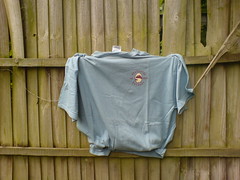
Shirts with just a logo are not very interesting. They’re not exciting enough.
The colour may be nice, but you want something more from a T than the colour alone.
It’s too neutral. One evaporates in all the public on the streets.
Breweries should know that.
They don’t want their beers to drown in the flood of alcoholic beverages that’s available on the market.
I’m glad the background of my fence is making it interesting again.
